In-Vehicle Payments UX: the Future of Connected Services
Why in-vehicle payments are becoming a core layer of the connected car
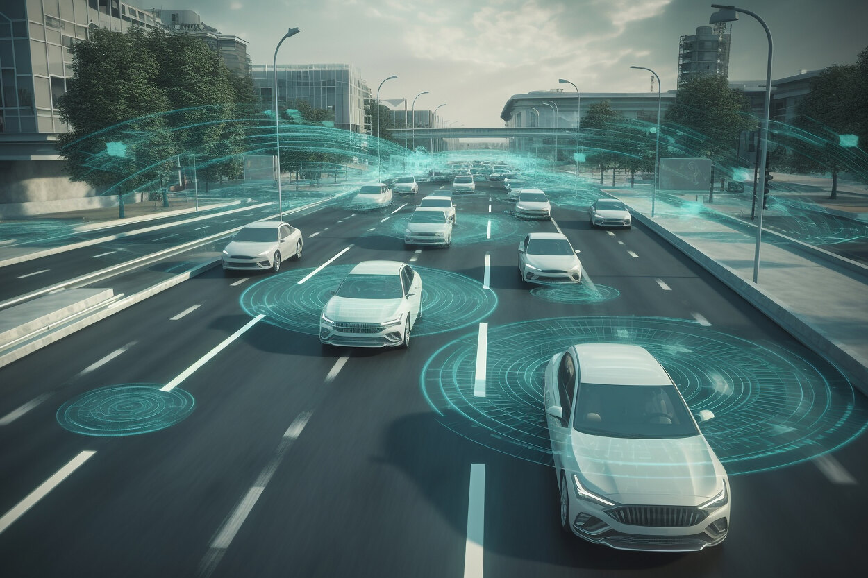
The connected car has evolved into much more than a vehicle equipped with navigation, entertainment and a network connection. As mobility shifts toward software-defined experiences, the car is becoming an adaptive digital environment where services unfold in real time. In this new landscape, in-vehicle payments are not an add-on feature but an integral layer of the journey, giving drivers the ability to complete essential transactions without leaving the cockpit. Every trip contains transactional touchpoints: tolls, charging, parking, quick-service retail, subscriptions or car washes. Moving these actions inside the vehicle transforms the driving experience into something more fluid and more intuitive. Instead of managing apps or terminals, the driver interacts with a unified, consistent interface that belongs to the vehicle itself.
How user expectations are changing inside the vehicle
Drivers today compare their automotive experiences not only with other vehicles but also with the digital ecosystems they use daily. They expect immediacy, simplicity and intelligence. They expect the vehicle to take initiative when appropriate, to personalise suggestions and to reduce manual steps. For many users, it feels outdated when a car that can navigate complex routes cannot automatically manage a parking session or initiate a charging payment. Expectations shift further when drivers think about interoperability. They want one payment identity across a variety of mobility services, without needing to sign into multiple accounts or re-enter data. As vehicles become more connected, user expectations grow faster than the industry’s ability to match them, which makes UX design for payments a differentiator.
The unique UX challenges of designing payment flows inside a car
Designing a payment experience in a moving environment is radically different from designing for a smartphone or laptop. The driver’s attention is divided, situational awareness fluctuates and time windows for interaction are limited. The cognitive load must remain exceptionally low, and any action must be clear, fast and safe. A payment flow that takes five steps on a mobile device may need to be compressed into two steps in a vehicle. Language must be unambiguous. Visual hierarchy must be simple. There is no room for decorative complexity or hidden actions. The vehicle interface must also behave predictably. When a driver authorises a transaction, the confirmation must be immediate and unmistakable. Small inconsistencies can undermine trust, especially because financial actions carry a higher psychological weight than navigation or media controls.
Why cognitive load and distraction shape every design decision
Every second of driver attention matters. A screen with dense information, a poorly placed confirmation button or unclear phrasing can increase cognitive effort, and even a short moment of confusion may compromise safety. This forces designers to strip payment flows down to their essentials. The question becomes: how can clarity and reassurance be delivered without excess detail? Often the answer lies in pre-selection, contextual filtering and intelligent defaults. If the vehicle already knows the user’s preferred payment method and previous behaviour patterns, it can streamline interactions dramatically. Reducing choice is often a form of improving safety.
Trust as the foundation of in-vehicle transactions
Payment UX inside a car must communicate reliability without overwhelming users with technical explanations. Drivers need to feel that their data is secure, their preferences are respected and their transactions are executed consistently. This is expressed not through long explanations but through a stable interaction language: consistent buttons, predictable confirmations, a clear history of completed actions and transparent settings that allow users to review or adjust automatic behaviours. Trust grows from familiarity. When the system behaves the same way every time, drivers rely on it more readily.
Regulations and regional limitations that impact UX
Automotive UX is shaped by strict regulations that vary across countries. Some jurisdictions restrict what can appear on the infotainment screen while the car is moving. Others impose extra confirmation requirements for financial transactions or define limits for automation. These rules influence not only what the driver sees but also when and how they can interact with the system. A robust payment UX must adapt to these changing contexts without breaking the flow. Achieving this requires designing flexible architectures that dynamically adjust behaviour based on driving mode, location and scenario.
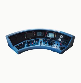
The role of hardware diversity in shaping interaction models
Because every vehicle brand uses a different combination of input methods—touchscreens, rotary controllers, haptic feedback, steering-wheel buttons or voice systems—the UX must remain coherent across all of them. A payment confirmation should always feel natural, independent of hardware. This means designers must create multimodal flows where essential actions are available through several channels. If touchscreens become inaccessible while driving, voice and steering-wheel controls should offer a safe alternative. Multimodality is not just convenience; in automotive environments, it is a requirement for safety and usability.
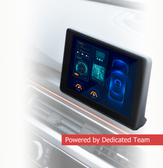
Contextual and predictive experiences: the next step for in-vehicle payments
Many of the most powerful UX improvements come from context awareness. Instead of forcing the driver to search for services, the system recognises patterns and anticipates needs. When the battery is low and the car approaches a charging station, it can prepare a one-tap payment suggestion. When the car enters a metered parking zone, the system can offer to start a session instantly. Predictions must remain subtle and respectful. If the system becomes too intrusive, users lose trust. If it remains too passive, its value diminishes. The ideal balance is a system that reacts quickly, presents relevant options naturally and never demands attention unnecessarily.
Why EV charging, parking, tolls and retail each require different UX patterns
Each payment scenario has its own behavioural logic. EV charging often requires planning based on availability, cost structure and expected duration. Parking involves timing, reminders and sometimes automatic session extension. Tolls typically demand automation because manual confirmation in these scenarios is unsafe and impractical. Retail and drive-through services introduce time pressure and workflow dependencies. One universal flow cannot cover all these cases. UX design must respect the specific rhythms of each scenario while maintaining a consistent overall interaction language.
What makes a payment experience feel truly seamless inside a vehicle
A seamless experience is one where every step feels obvious and frictionless. The system hides its complexity and presents only the necessary information. Invisible UX does not minimise user agency—it reduces unnecessary decisions. Drivers should never feel that they are navigating a menu but rather confirming an action that aligns naturally with their intent. The key to invisibility is timing. A suggestion shown too early or too late becomes noise. A suggestion shown at the right moment becomes value.
Automation versus control: how much initiative should the car take?
One of the hardest questions in payment UX is determining how autonomous the system should be. Should tolls be fully automated? Should charging sessions begin without manual confirmation? Should the system renew subscriptions on its own? Drivers consistently want convenience, but they also want control. The solution is not choosing one side but offering adjustable modes. Some users prefer maximum automation. Some want manual confirmations. Many prefer a hybrid model. UX must make these settings easy to understand, easy to modify and always transparent.

Design principles for safe and seamless in-vehicle transactions
The strongest design principle is economy: reducing steps while preserving clarity. Each additional gesture or screen increases cognitive load. Another principle is multimodality, ensuring that voice, touch and physical controls complement one another. Visual design must remain calm, with moderate contrast, clear spacing and predictable layouts. Language must be concise, consistent and concrete. The interface should never force drivers to interpret ambiguous instructions. Finally, flows must adjust to driving state. While parked, users can manage accounts or browse offers; while driving, only the simplest confirmations should be allowed.
How in-vehicle payments evolve within the software-defined vehicle era
Software-defined vehicles introduce continuous updates, dynamic feature activation and service bundles that evolve throughout the vehicle’s lifetime. Payments become infrastructure: a layer that enables subscriptions, upgrades and new capabilities delivered over time. As new services enter the ecosystem, payment UX must scale without losing coherence. This requires flexible navigation structures and a stable interaction vocabulary that can grow as the feature set expands.
Promwad’s perspective on creating payment UX for automotive platforms
Promwad approaches in-vehicle payment UX through a combination of user research, embedded engineering and system-level thinking. The goal is not only to design attractive screens but to build flows that work reliably under real driving conditions. Different OEMs require different technical approaches, and each platform—whether built on Linux, QNX or Android Automotive—creates its own constraints. Promwad focuses on translating these constraints into simple interactions that feel effortless to drivers, aligning engineering logic with human behaviour.
What will shape the next generation of in-vehicle payment experiences
The next wave of innovation will be defined by predictive intelligence, deeper service ecosystems, multimodal interaction and frictionless automation. But the true differentiator will be trust. Drivers will increasingly expect vehicles to handle more tasks automatically, yet they will only allow this if they believe the system behaves consistently and respects their preferences. Payment UX will continue evolving toward fewer steps, stronger context awareness, calmer visual language and richer service integration. A future vehicle may not simply execute transactions—it may orchestrate mobility experiences end-to-end, with payments happening quietly in the background.
AI Overview
In-vehicle payments enable seamless transactions embedded directly into the driving journey. Key Applications: charging, tolls, parking, drive-through services, maintenance and subscription features. Benefits: reduced friction, higher safety, unified mobility experiences, better service adoption and stronger customer retention. Challenges: cognitive load, trust, regulatory constraints, multimodal interaction complexity and varied hardware environments. Outlook: payments will become a foundational layer of software-defined mobility, shifting from optional features to standard expectations across OEMs. Related Terms: connected services, mobility UX, IVI systems, in-car commerce, transactional HMI.
Our Case Studies